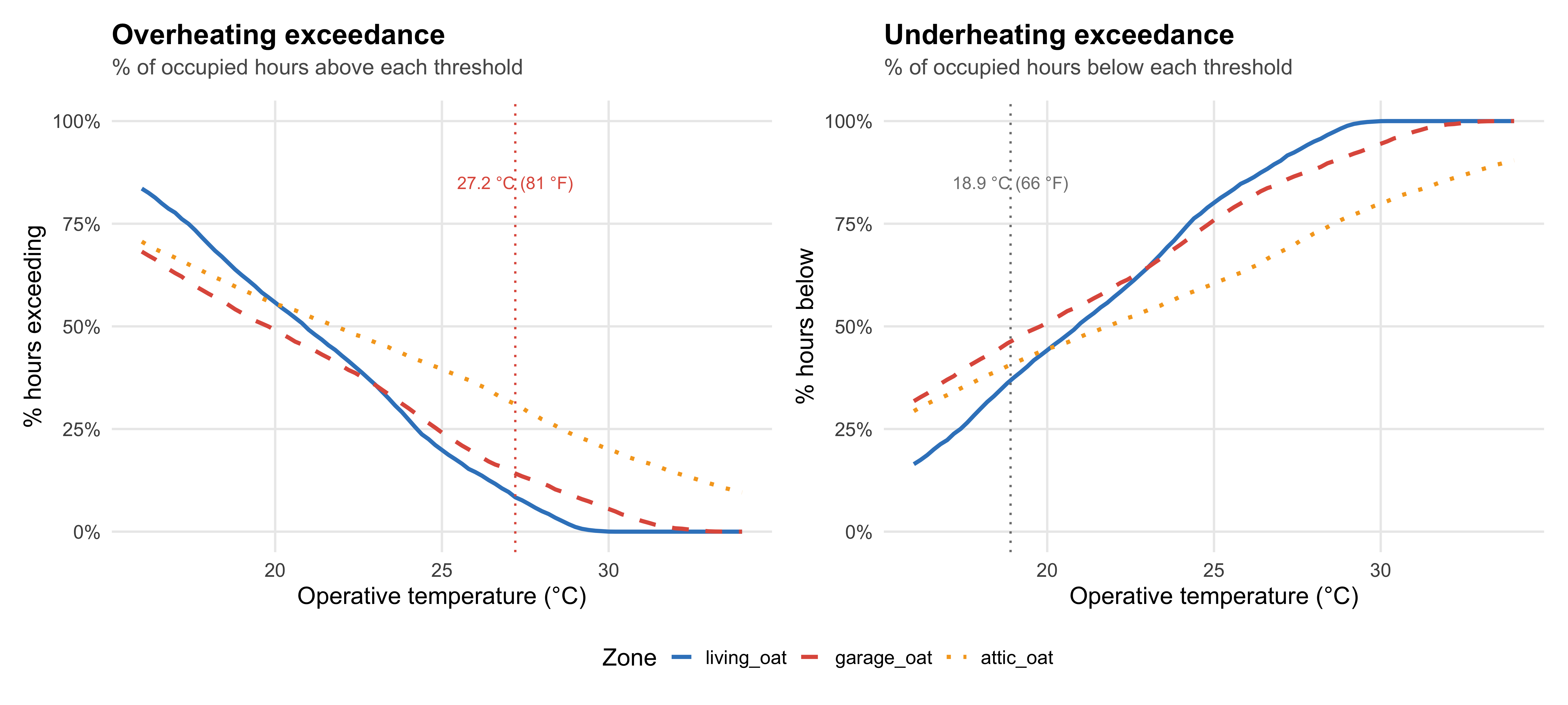
library(tidyverse)
library(scales)
library(patchwork)

source(here::here("src", "R", "x_theme.R"))

# ------------------------------------------------------------
# DATA REQUIREMENTS
# ------------------------------------------------------------
# Your data should be a long-format dataframe with:
#   - zone:     character/factor, zone identifier
#   - op_temp:  numeric, operative temperature [°C]
#   - occupied: integer, 0/1 occupancy indicator
# ------------------------------------------------------------

# SAMPLE DATA (replace with your own hourly timeseries)
# Three zones generated with increasing temperature amplitude
set.seed(42)
make_zone <- function(base, amp_annual, amp_diurnal, sd_noise, label) {
  expand.grid(doy = 1:365, hour_day = 0:23) %>%
    as_tibble() %>%
    mutate(
      annual   = -cos(2 * pi * doy / 365),
      diurnal  = sin(pi * hour_day / 12 - pi / 6),
      op_temp  = base + amp_annual * annual + amp_diurnal * diurnal + rnorm(n(), 0, sd_noise),
      occupied = as.integer(hour_day >= 7 & hour_day <= 22),
      zone     = label
    )
}

op_temp_long <- bind_rows(
  make_zone(21, 5.5, 2.5, 0.6, "living_oat"),
  make_zone(20, 8.0, 3.5, 1.0, "garage_oat"),
  make_zone(22, 11.0, 5.0, 1.5, "attic_oat")
) %>%
  mutate(zone = factor(zone, levels = c("living_oat", "garage_oat", "attic_oat")))

# Zone appearance (update names and colours to match your zones)
zone_colours   <- c(living_oat = "#3A85C6", garage_oat = "#E05C4B", attic_oat = "#F5A623")
zone_linetypes <- c(living_oat = "solid",   garage_oat = "dashed",  attic_oat = "dotted")

# Empirical CCDF for each zone (occupied hours only)
thresholds <- seq(16, 34, by = 0.2)

exceedance <- op_temp_long %>%
  filter(occupied > 0) %>%
  group_by(zone) %>%
  summarise(data = list(op_temp), .groups = "drop") %>%
  mutate(
    exc = map(data, \(x) tibble(
      temp      = thresholds,
      pct_above = map_dbl(thresholds, \(t) mean(x > t) * 100),
      pct_below = map_dbl(thresholds, \(t) mean(x < t) * 100)
    ))
  ) %>%
  select(-data) %>%
  unnest(exc)

# ------------------------------------------------------------
# PLOT
# ------------------------------------------------------------
p_above <- ggplot(exceedance, aes(x = temp, y = pct_above, colour = zone, linetype = zone)) +
  geom_line(linewidth = 0.9) +
  geom_vline(xintercept = 27.2, linetype = "dotted", colour = "#E05C4B") +
  annotate("text", x = 27.2, y = 85, label = "27.2 °C (81 °F)",
           size = 2.8, colour = "#E05C4B") +
  scale_colour_manual(values = zone_colours) +
  scale_linetype_manual(values = zone_linetypes) +
  scale_y_continuous(labels = label_percent(scale = 1), limits = c(0, 100)) +
  labs(
    title    = "Overheating exceedance",
    subtitle = "% of occupied hours above each threshold",
    x = "Operative temperature (°C)", y = "% hours exceeding",
    colour = "Zone", linetype = "Zone"
  ) +
  theme_ep()

p_below <- ggplot(exceedance, aes(x = temp, y = pct_below, colour = zone, linetype = zone)) +
  geom_line(linewidth = 0.9) +
  geom_vline(xintercept = 18.9, linetype = "dotted", colour = "grey50") +
  annotate("text", x = 18.9, y = 85, label = "18.9 °C (66 °F)",
           size = 2.8, colour = "grey50") +
  scale_colour_manual(values = zone_colours) +
  scale_linetype_manual(values = zone_linetypes) +
  scale_y_continuous(labels = label_percent(scale = 1), limits = c(0, 100)) +
  labs(
    title    = "Underheating exceedance",
    subtitle = "% of occupied hours below each threshold",
    x = "Operative temperature (°C)", y = "% hours below",
    colour = "Zone", linetype = "Zone"
  ) +
  theme_ep()

p_above + p_below +
  plot_layout(guides = "collect") &
  theme(legend.position = "bottom")