library(tidyverse)
library(scales)

source(here::here("src", "R", "x_theme.R"))

# ------------------------------------------------------------
# DATA REQUIREMENTS
# ------------------------------------------------------------
# Your data should be a dataframe with:
#   - doy:        integer, day of year (1–365)
#   - hour_day:   integer, hour of day (0–23)
#   - living_oat: numeric, zone operative temperature [°C]
# ------------------------------------------------------------

# SAMPLE DATA (replace with your own hourly timeseries)
set.seed(42)
ep_synth <- expand.grid(doy = 1:365, hour_day = 0:23) %>%
  as_tibble() %>%
  mutate(
    annual     = -cos(2 * pi * doy / 365),
    diurnal    = sin(pi * hour_day / 12 - pi / 6),
    living_oat = 21 + 5.5 * annual + 2.5 * diurnal + rnorm(n(), 0, 0.6)
  )

# ------------------------------------------------------------
# PLOT
# ------------------------------------------------------------
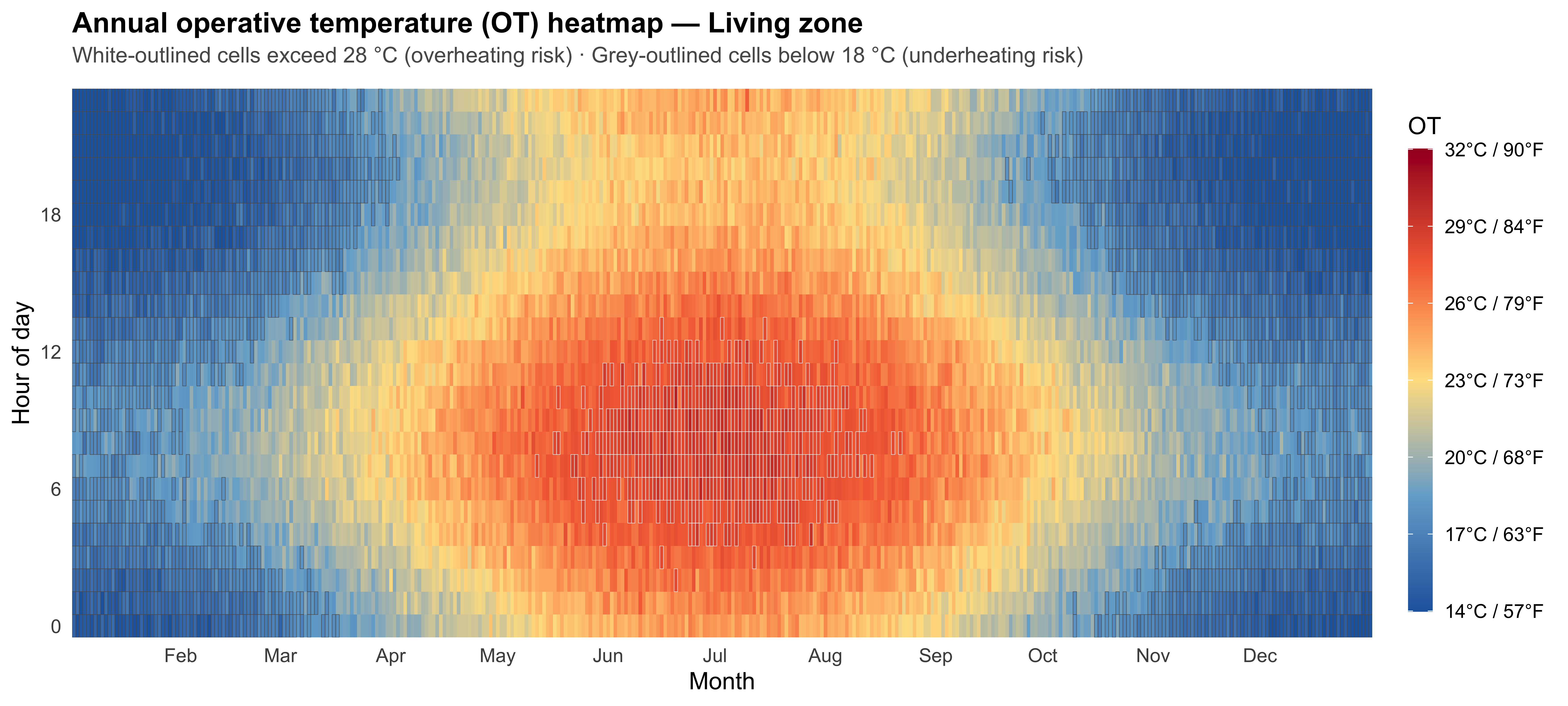
ep_synth %>%
  ggplot(aes(x = doy, y = hour_day, fill = living_oat)) +
  geom_tile() +
  scale_fill_gradientn(
    colours = c("#2166AC", "#74ADD1", "#FEE090", "#F46D43", "#A50026"),
    name    = "OT",
    limits  = c(14, 32),
    oob     = squish,
    breaks  = seq(14, 32, by = 3),
    labels  = function(x) paste0(x, "°C / ", round(x * 9 / 5 + 32), "°F")
  ) +
  geom_tile(
    data   = . %>% filter(living_oat > 28),
    fill   = NA, colour = "#F5F3F3", linewidth = 0.1, alpha = 0.6
  ) +
  geom_tile(
    data   = . %>% filter(living_oat < 18),
    fill   = NA, colour = "#5C5C5F", linewidth = 0.1, alpha = 0.6
  ) +
  scale_x_continuous(
    breaks = c(0, cumsum(c(31, 28, 31, 30, 31, 30, 31, 31, 30, 31, 30, 31))),
    labels = c(month.abb, ""),
    expand = c(0, 0)
  ) +
  scale_y_continuous(breaks = seq(0, 23, 6), expand = c(0, 0)) +
  labs(
    title    = "Annual operative temperature (OT) heatmap — Living zone",
    subtitle = "White-outlined cells exceed 28 °C (overheating risk) · Grey-outlined cells below 18 °C (underheating risk)",
    x = "Month",
    y = "Hour of day"
  ) +
  theme_ep() +
  theme(
    panel.grid        = element_blank(),
    legend.position   = "right",
    legend.key.height = unit(1.5, "cm")
  )