library(tidyverse)
library(scales)

source(here::here("src", "R", "x_theme.R"))

# ------------------------------------------------------------
# DATA REQUIREMENTS
# ------------------------------------------------------------
# Your data should be a dataframe with:
#   - set:       numeric, Standard Effective Temperature [°C]
#   - month_num: integer, month number (1–12)
#   - occupied:  integer, 0/1 occupancy indicator
# ------------------------------------------------------------

# SAMPLE DATA (replace with your own hourly timeseries)
set.seed(42)
ep_synth <- expand.grid(doy = 1:365, hour_day = 0:23) %>%
  as_tibble() %>%
  mutate(
    month_num = as.integer(format(as.Date(doy - 1, origin = "2025-01-01"), "%m")),
    annual    = -cos(2 * pi * doy / 365),
    diurnal   = sin(pi * hour_day / 12 - pi / 6),
    set       = 23 + 2.5 * annual + 1.2 * diurnal + rnorm(n(), 0, 0.5),
    occupied  = as.integer(hour_day >= 7 & hour_day <= 22)
  )

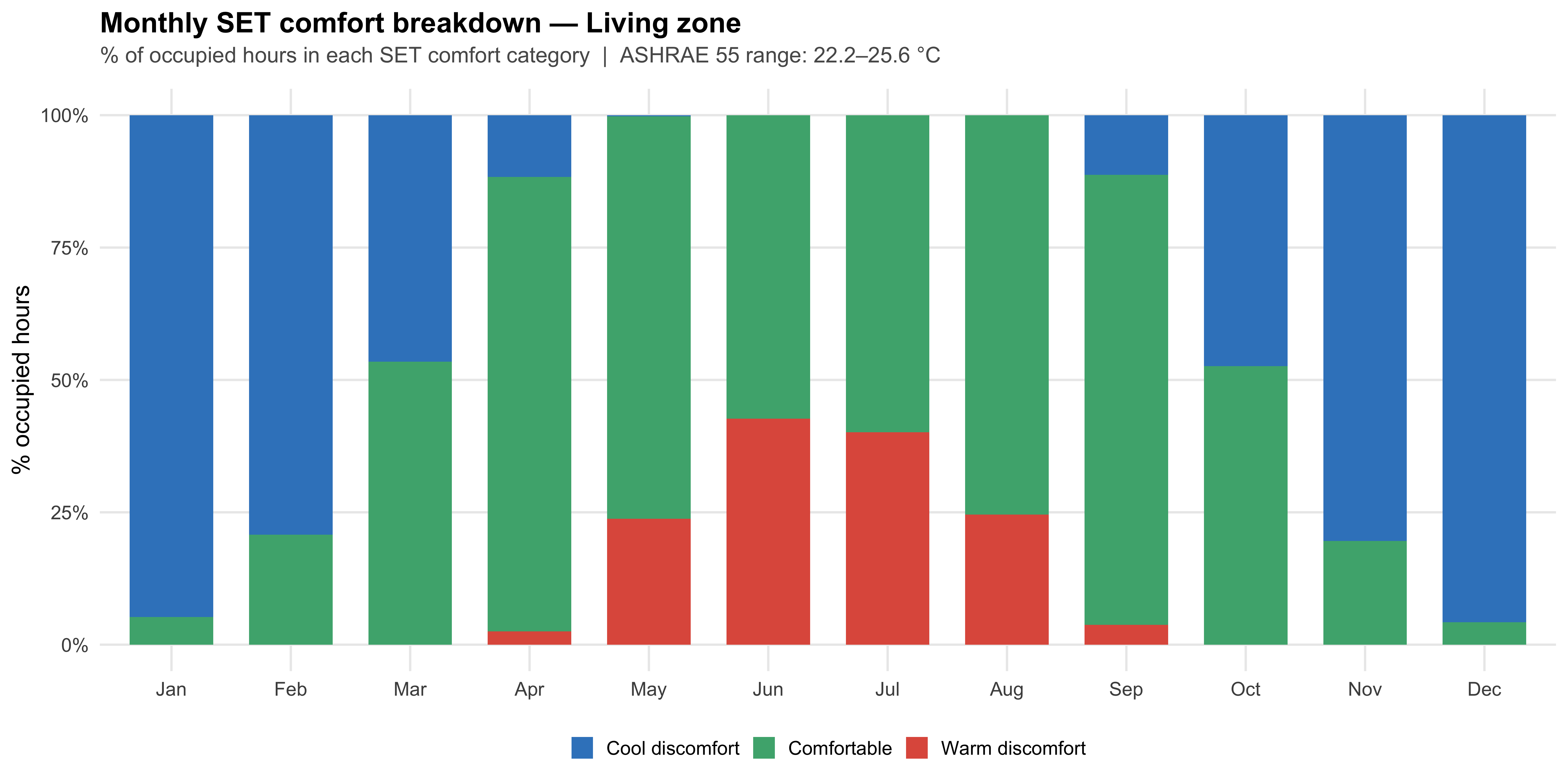
# Monthly SET breakdown (ASHRAE 55 comfort range: 22.2–25.6 °C)
monthly_comfort <- ep_synth %>%
  filter(occupied > 0) %>%
  mutate(
    comfort_cat = factor(case_when(
      set < 22.2 ~ "Cool discomfort",
      set > 25.6 ~ "Warm discomfort",
      TRUE        ~ "Comfortable"
    ), levels = names(comfort_colours))
  ) %>%
  count(month_num, comfort_cat) %>%
  group_by(month_num) %>%
  mutate(pct = n / sum(n) * 100) %>%
  ungroup() %>%
  mutate(month = factor(month.abb[month_num], levels = month.abb))

# ------------------------------------------------------------
# PLOT
# ------------------------------------------------------------
ggplot(monthly_comfort, aes(x = month, y = pct, fill = comfort_cat)) +
  geom_col(width = 0.7) +
  scale_fill_manual(values = comfort_colours, name = NULL) +
  scale_y_continuous(labels = label_percent(scale = 1)) +
  labs(
    title    = "Monthly SET comfort breakdown — Living zone",
    subtitle = "% of occupied hours in each SET comfort category  |  ASHRAE 55 range: 22.2–25.6 °C",
    x = NULL,
    y = "% occupied hours"
  ) +
  theme_ep()